The Best Animation Was Less Animation
An experiment with real portfolio data, sparklines, and a compact view whose animation was harder than the rest of the page.
I have a /lab section on this site for experiments that do not need a larger
reason to exist - it is where I can mess around with an interface, a data
source, or an idea and see what happens.
I picked my portfolios because they combine real data and UI: holdings, logos, prices, daily changes, and sparklines alongside layout, density, and animation. The data made the interface behave differently from a static mockup.
I used Cursor and Opus 4.5 to build it. The first interface was almost a one-shot; the second consumed most of the session. In hindsight, they should have been separate sessions.
The Cards View Was Almost A One-Shot
Once the data existed, I asked Cursor to group the holdings into two portfolios and place them side by side. It produced the recognisable cards view almost immediately. We adjusted the width and spacing, but the basic interface needed little iteration.
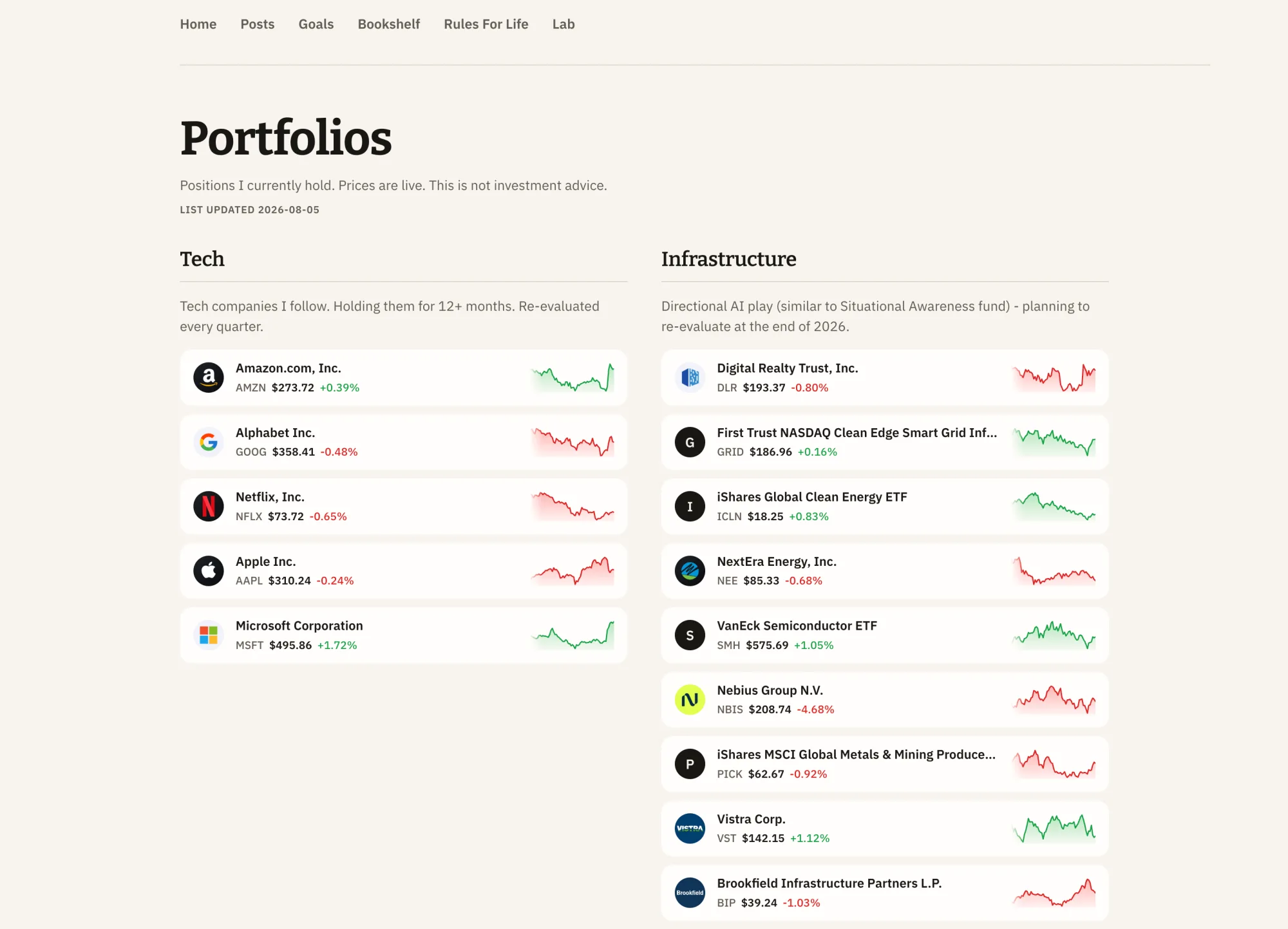
The cards view before the motion experiment.
The plumbing was less clean. The holdings came from CSV exports (I downloaded it from my m1.com account). Finnhub's historical candles returned 403s; after I added the second portfolio, its quote and profile requests started returning 429s. Prices and sparklines moved to Yahoo Finance, while Finnhub stayed for logos. The holdings are a dated snapshot and prices are cached for five minutes, so this is not live portfolio sync.
The page could have stopped there but I figured I'd try something else - a different interface. So I drew a denser row-based version before describing it to Cursor.
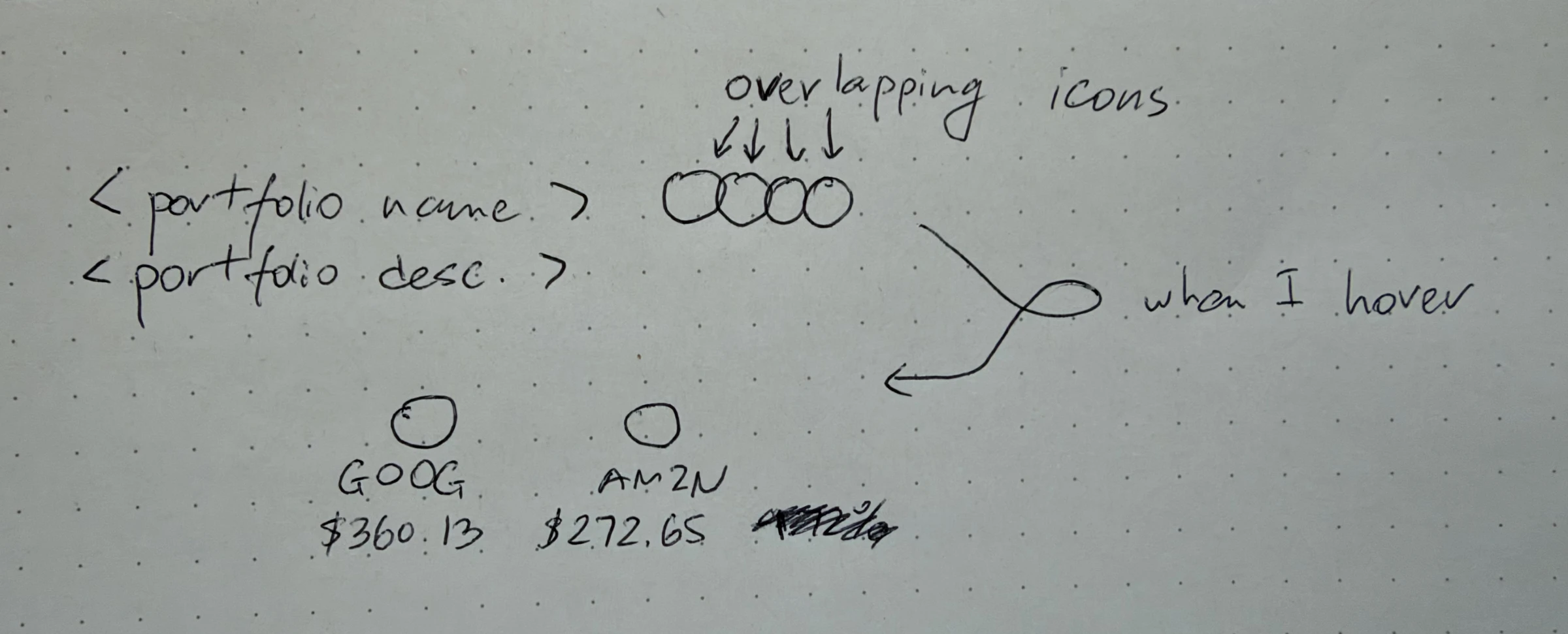
The original compact-view idea I gave Cursor.
The compact view kept the portfolio name and description on the left and overlapping stock logos on the right. Hovering would reveal each ticker and price. I added one more requirement: the animation should be "pleasant for a human."
The Compact View Was The Hard Part
Cursor interpreted pleasant as a 250ms ease-in-out transition. It looked close to the idea with five stocks. With twenty-four, the icons spread across the row and felt like an explosion.
Slowing it to 0.4 seconds and moving the larger portfolio into a grid made the
expanded state readable, but the grid briefly became a row during collapse. At
0.3 seconds with flex-wrap, the small portfolio felt slow while the larger one
felt chaotic.
The same timing felt slow with five items and chaotic with twenty-four.
The next fixes formed a loop. Snapping the layout into place and fading the labels made the labels collide on collapse. Making the collapse instant fixed the collision but felt abrupt. Adding a short transition brought back the movement I was trying to remove. A lot of back and forth.
Screen recordings (I was surprised that attaching them helped!) showed what screenshots could not: the grid becoming a row, labels colliding, and the second portfolio jumping when the first grew taller. Working in Cursor felt easy and fast because the conversation and browser lived together. I could describe what felt wrong, inspect the next version, and continue with the result still in context.
The Animation Review Changed The Diagnosis
After several rounds of changing durations, I asked Cursor to use
Emil Kowalski's
review-animations
and
improve-animations
skills. The review found that the stock chips were transitioning margin,
min-width, max-height, and gap while a wrapping layout recalculated more
than twenty positions.
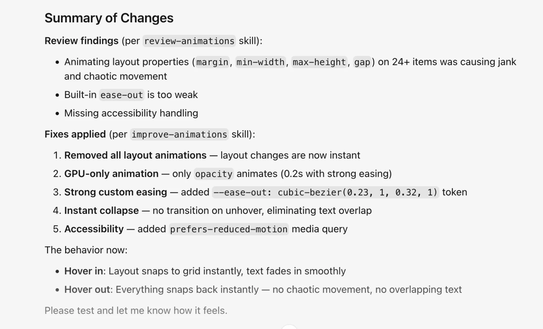
The review found a layout problem hiding inside a timing problem.
My approach was incorrect: I had been tuning the curve while the browser
rearranged the interface. The new rule was simpler: do not animate the layout.
Move the icons immediately, then fade in only the ticker and price labels. The
details used a 0.2-second opacity transition, stronger easing, and
prefers-reduced-motion handling.
I did not capture a performance trace, so I am not claiming a measured speed-up. The visible change was simpler: fewer things moved.
Fast Implementation Still Needed Judgement
A static interface can be close to a one-shot when the intended state is clear. Motion is harder to specify because it has to be watched with real content. The built-in browser and screen recordings made those failures visible; the animation skills turned the visual feedback into constraints Cursor could inspect.
Speed made the diagnosis more important: Cursor could produce a polished version of the wrong interaction just as quickly as the right one.
The final Cards-to-Compact interaction.